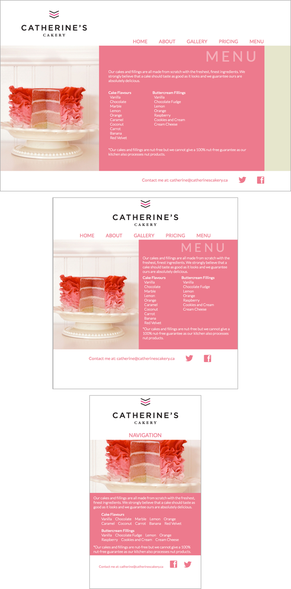
- Problem
- To create a fully responsive website for a cake shop. The website must have a flexible layout so that it can be viewed on screen sizes from 240 px to over 2000 px and on anything in between.
- Solution
- I used CSS and media queries so that depending on whether you're viewing the site on a computer or a mobile device, and based on the screen dimensions, the layout of the site will change so that it's always showing an optimal view. Click on the image to be taken to the actual site, then change the size of the browser window to demonstrate the effect.
- PREVIOUS NEXT
MIKE IS A DESIGNER
BUY PAINTINGS AND PRINTS
- I love to
- draw, paint and illustrate
- layout type
- animate things
- take photos
- design websites
- Contact
- mb [at] mikesblender [dot] com